Date/Time Picker Properties
Description
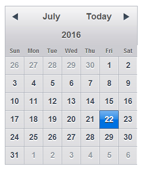
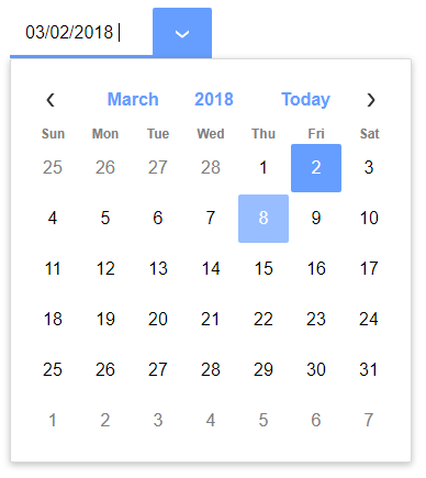
If you add a calendar control or a text box with a time type (Date or Time) to your component, the Date/Time Picker properties can be used to configure the calender/time control.
- Name
- Description
- Calendar height
Specify the height of the calendar control container. Use CSS syntax (e.g. 3in, 200px). Leave blank to use the calendar width as the container width.
- Calendar width
Specify the width of the calendar control container. Use CSS syntax (e.g. 3in, 200px). Leave blank to use the calendar width as the conatiner width.
- Date format
Specify the date format in which dates will be returned when the user makes a selection from the Date Picker.
- Date item hover class name
Class name to use when hovering over a date. Leave blank to use default.
- Date item out of range class name
Class name for dates that are not in the current month. Leave blank to use default.
- Date item selected class name
Class name to use for the selected date. Leave blank to use default.
- Date item style
Specify the in-line style for the date items on the calendar. You can use this property to set the size of the item. For example, to set the date item size to a 1in box: height: 1in; width: 1in;
- Disabled specific dates
Specify if certain dates on the calendar should be shown as disabled.
- Disabled days
Specify disabled days in the calender. Enter a comma delimited list. e.g. 0.6 to disable dates on Sunday and Saturday. 0=Sunday, 1=Monday and so on. You can also enter: function:yourFunctionName if you want to define a Javascript function to dynamically return a comma delimited list of disabled days.
- Draw boxes around dates
Specify if a box should be drawn around each date item.
- Has events
Specify if you want to define event handlers for the various events raised by the Date Picker.
- High date
Specify the highest date value that the Date/Time picker will show. You can compute this value dynamically using a Javascript function that gets called when the Date/Time picker is opened.
- Lock column widths
Specify if all columns widths should be the same, or can be different. Only meaningful when day names are of different lengths.
- Low date
Specify the lowest date value that the Date/Time picker will show. You can compute this value dynamically using a Javascript function that gets called when the Date/Time picker is opened.
- Show 'Today' button
Specify if the 'Today' button should be shown.
- Show days of week
Specify if the days of the weeks should be shown as column titles on the Date/Time picker.
- Show weeks of year
Specify if the week of the year for each week shown on the calendar should be shown. The week of the year is displayed in the first column on the calendar.
- Switch year
Specify how the date picker will interpret 2 digit years. If you want to define how the server will interpret 2 digit years for this component, you must set the Switch year in the UX Properties, Other section.
- Time picker customization
Customize the choices for the hours, minutes, and seconds in the time picker.